
import matplotlib.pyplot as plt

plt.plot([-1, -4.5, 16, 23, 78, 22, 3])
plt.show()
Live Python classes by highly experienced instructors:
 [instructor-led training course]
Instructor-led training courses by Bernd Klein
This website contains a free and extensive online tutorial by Bernd Klein, using material from his classroom Python training courses.
If you are interested in an instructor-led classroom training course, have a look at these Python classes:
[instructor-led training course]
Instructor-led training course by Bernd Klein at Bodenseo
Image kabliczech - Fotolia.com
This page was written by Bernd Klein.
Bernd is an experienced computer scientist with a history of working in the education management industry and is skilled in Python, Perl, Computer Science, and C++. He has a Dipl.-Informatiker / Master Degree focused in Computer Science from Saarland University.
 [PDF logo] PDF version of this site
This website is free of annoying ads. We want to keep it like this. You can help with your donation:
[Go]13. Formatting a plot in Matplotlib
By Bernd Klein. Last modified: 24 Mar 2022.
Format Parameter
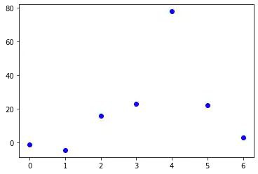
What we see is a continuous graph, even though we provided discrete data for the Y values. By adding a format string to the function call of plot, we can create a graph with discrete values, in our case blue circle markers. The format string defines the way how the discrete points have to be rendered.
import matplotlib.pyplot as plt

plt.plot([-1, -4.5, 16, 23, 78, 22, 3], "ob")
plt.show()
Live Python training
Enjoying this page? We offer live Python training courses covering the content of this site.
See our Python training courses
The format parameter of pyplot.plot
We have used "ob" in our previous example as the format parameter. It consists of two characters. The first one defines the line style or the dicrete value style, i.e. the markers, while the second one chooses a colour for the graph. The order of the two characters could have been reversed, i.e. we could have written it as "bo" as well. If the format parameter is not given, as in the first example, the default value is "b-", i.e. a solid blue line.
The following format string characters are accepted to control the line style or marker:
=============================================
character       description
=============================================
'-'             solid line style
'--'            dashed line style
'-.'            dash-dot line style
':'             dotted line style
'.'             point marker
','             pixel marker
'o'             circle marker
'v'             triangle_down marker
'^'             triangle_up marker
'<'             triangle_left marker
'>'             triangle_right marker
'1'             tri_down marker
'2'             tri_up marker
'3'             tri_left marker
'4'             tri_right marker
's'             square marker
'p'             pentagon marker
'*'             star marker
'h'             hexagon1 marker
'H'             hexagon2 marker
'+'             plus marker
'x'             x marker
'D'             diamond marker
'd'             thin_diamond marker
'|'             vline marker
'_'             hline marker
===============================================
The following color abbreviations are supported:
==================
character   color
==================
'b'         blue
'g'         green
'r'         red
'c'         cyan
'm'         magenta
'y'         yellow
'k'         black
'w'         white
==================
As you may have guessed already, you can add X values to the plot function. We will use the multiples of 3 starting at 3 below 22 as the X values of the plot in the following example:
import matplotlib.pyplot as plt

# our X values:
days = list(range(0, 22, 3))
print("Values of days:", days)
# our Y values:
celsius_values = [25.6, 24.1, 26.7, 28.3, 27.5, 30.5, 32.8, 33.1]

plt.plot(days, celsius_values)
plt.show()
OUTPUT:
Values of days: [0, 3, 6, 9, 12, 15, 18, 21]

... and once more with discrete values:
plt.plot(days, celsius_values, 'bo')
plt.show()

![[instructor-led training course]](https://www.python-course.eu/images/common/classroom_training_courses.jpg)
![[PDF versions of this site]](https://www.python-course.eu/images/common/PDF_150w.webp)
![[PDF logo]](https://www.python-course.eu/images/common/pdf_logo_20w.webp)
![[formatting-plot-in-matplotlib 2: Graph 1]](https://www.python-course.eu/images/numerical-programming/formatting-plot-in-matplotlib_2.webp)
![[formatting-plot-in-matplotlib 3: Graph 2]](https://www.python-course.eu/images/numerical-programming/formatting-plot-in-matplotlib_3.webp)
![[formatting-plot-in-matplotlib 4: Graph 3]](https://www.python-course.eu/images/numerical-programming/formatting-plot-in-matplotlib_4.webp)
Live Python training
Enjoying this page? We offer live Python training courses covering the content of this site.
Upcoming online Courses
See our Python training courses