
Drop-down menus let users click an icon, text field, or other component, and then select from a list of options on a temporary surface. This guide describes how to create both basic menus and more complex menus with dividers and icons.
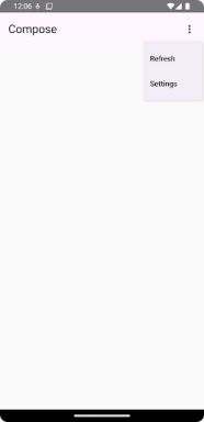 [A dropdown menu with two options displayed. An icon with three vertical dots indicates that clicking it opens the menu.]
Figure 1. A basic drop-down menu with two items listed.
[A dropdown menu with two options displayed. An icon with three vertical dots indicates that clicking it opens the menu.]
Figure 1. A basic drop-down menu with two items listed.
API surface
Use DropdownMenu, DropdownMenuItem, and the IconButton
components to implement a custom drop-down menu. The DropdownMenu and
DropdownMenuItem components are used to display the menu items, while the
IconButton is the trigger to display or hide the drop-down menu.
The key parameters for the DropdownMenu component include the following:
expanded: Indicates whether the menu is visible.onDismissRequest: Used to handle menu dismissal.content: The composable content of the menu, typically containingDropdownMenuItemcomposables.
The key parameters for DropdownMenuItem include the following:
text: Defines the content displayed in the menu item.onClick: Callback to handle interaction with the item in the menu.
Create a basic drop-down menu
The following snippet demonstrates a minimal DropdownMenu implementation:
@Composable fun MinimalDropdownMenu() { var expanded by remember { mutableStateOf(false) } Box( modifier = Modifier .padding(16.dp) ) { IconButton(onClick = { expanded = !expanded }) { Icon(Icons.Default.MoreVert, contentDescription = "More options") } DropdownMenu( expanded = expanded, onDismissRequest = { expanded = false } ) { DropdownMenuItem( text = { Text("Option 1") }, onClick = { /* Do something... */ } ) DropdownMenuItem( text = { Text("Option 2") }, onClick = { /* Do something... */ } ) } } }
Key points about the code
- Defines a basic
DropdownMenucontaining two menu items. - The
expandedparameter controls the menu's visibility as expanded or collapsed. - The
onDismissRequestparameter defines a callback that executes when the user closes the menu. - The
DropdownMenuItemcomposable represents selectable items in the drop-down menu. - An
IconButtontriggers the expansion and collapse of the menu.
Result
 [A dropdown menu triggered by an icon with three vertical dots. The menu displays two selectable options, Option 1 and Option 2.]
Figure 2. A minimal drop-down menu with only two options.
[A dropdown menu triggered by an icon with three vertical dots. The menu displays two selectable options, Option 1 and Option 2.]
Figure 2. A minimal drop-down menu with only two options.
Create a longer drop-down menu
DropdownMenu is scrollable by default if all the menu items can't be displayed
at once. The following snippet creates a longer, scrollable drop-down menu:
@Composable fun LongBasicDropdownMenu() { var expanded by remember { mutableStateOf(false) } // Placeholder list of 100 strings for demonstration val menuItemData = List(100) { "Option ${it + 1}" } Box( modifier = Modifier .padding(16.dp) ) { IconButton(onClick = { expanded = !expanded }) { Icon(Icons.Default.MoreVert, contentDescription = "More options") } DropdownMenu( expanded = expanded, onDismissRequest = { expanded = false } ) { menuItemData.forEach { option -> DropdownMenuItem( text = { Text(option) }, onClick = { /* Do something... */ } ) } } } }
Key points about the code
- The
DropdownMenuis scrollable when the total height of its content exceeds the available space. This code creates a scrollableDropdownMenuthat displays 100 placeholder items. - The
forEachloop dynamically generatesDropdownMenuItemcomposables. The items are not lazily created, which means that all 100 drop-down items are created and exist in the composition. - The
IconButtontriggers the expansion and collapse of theDropdownMenuwhen clicked. - The
onClicklambda within eachDropdownMenuItemlets you define the action performed when the user selects a menu item.
Result
The preceding code snippet produces the following scrollable menu:
 [A dropdown menu with many options, requiring scrolling to view all
items.]
Figure 3. A long, scrollable drop-down menu.
[A dropdown menu with many options, requiring scrolling to view all
items.]
Figure 3. A long, scrollable drop-down menu.
Create a longer drop-down menu with dividers
The following snippet shows a more advanced implementation of a drop-down menu. In this snippet, leading and trailing icons are added to menu items, and dividers separate groups of menu items.
@Composable fun DropdownMenuWithDetails() { var expanded by remember { mutableStateOf(false) } Box( modifier = Modifier .fillMaxWidth() .padding(16.dp) ) { IconButton(onClick = { expanded = !expanded }) { Icon(Icons.Default.MoreVert, contentDescription = "More options") } DropdownMenu( expanded = expanded, onDismissRequest = { expanded = false } ) { // First section DropdownMenuItem( text = { Text("Profile") }, leadingIcon = { Icon(Icons.Outlined.Person, contentDescription = null) }, onClick = { /* Do something... */ } ) DropdownMenuItem( text = { Text("Settings") }, leadingIcon = { Icon(Icons.Outlined.Settings, contentDescription = null) }, onClick = { /* Do something... */ } ) HorizontalDivider() // Second section DropdownMenuItem( text = { Text("Send Feedback") }, leadingIcon = { Icon(Icons.Outlined.Feedback, contentDescription = null) }, trailingIcon = { Icon(Icons.AutoMirrored.Outlined.Send, contentDescription = null) }, onClick = { /* Do something... */ } ) HorizontalDivider() // Third section DropdownMenuItem( text = { Text("About") }, leadingIcon = { Icon(Icons.Outlined.Info, contentDescription = null) }, onClick = { /* Do something... */ } ) DropdownMenuItem( text = { Text("Help") }, leadingIcon = { Icon(Icons.AutoMirrored.Outlined.Help, contentDescription = null) }, trailingIcon = { Icon(Icons.AutoMirrored.Outlined.OpenInNew, contentDescription = null) }, onClick = { /* Do something... */ } ) } } }
This code defines a DropdownMenu within a Box.
Key points about the code
- The
leadingIconandtrailingIconparameters add icons to the start and end of aDropdownMenuItem. - An
IconButtontriggers the menu's expansion. - The
DropdownMenucontains severalDropdownMenuItemcomposables, each representing a selectable action. HorizontalDividercomposables insert a horizontal line to separate groups of menu items.
Result
The preceding snippet produces a drop-down menu with icons and dividers:
 [A dropdown menu with sections for Profile, Settings, Send Feedback, About, and Help. Each option has an icon, such as a person icon for Profile.]
Figure 4. A drop-down menu divided into sections with leading and trailing icons.
[A dropdown menu with sections for Profile, Settings, Send Feedback, About, and Help. Each option has an icon, such as a person icon for Profile.]
Figure 4. A drop-down menu divided into sections with leading and trailing icons.
Additional resources
- Material Design: Menus


![[Android Developers]](https://www.gstatic.com/devrel-devsite/prod/v0f3a5b8b76e4a120372a69044e02756e703b6140f9f1812c6e4a0407b19864b7/android/images/lockup.png)
![[A dropdown menu with two options displayed. An icon with three vertical dots indicates that clicking it opens the menu.]](http://developer.android.com/static/develop/ui/compose/images/components/basicmenu1.png)
![[A dropdown menu triggered by an icon with three vertical dots. The menu displays two selectable options, Option 1 and Option 2.]](http://developer.android.com/static/develop/ui/compose/images/components/MinimalDropdownMenu.png)
![[A dropdown menu with many options, requiring scrolling to view all items.]](http://developer.android.com/static/develop/ui/compose/images/components/LongBasicDropdownMenu.png)
![[A dropdown menu with sections for Profile, Settings, Send Feedback, About, and Help. Each option has an icon, such as a person icon for Profile.]](http://developer.android.com/static/develop/ui/compose/images/components/DropdownMenuWithDetails.png)
![[X]](http://developer.android.com/_static/android/images/logo-x.svg)
![[YouTube]](http://www.gstatic.com/images/icons/material/product/2x/youtube_48dp.png)
![[LinkedIn]](http://developer.android.com/_static/android/images/logo-linkedin.svg)
![[Google Developers]](https://www.gstatic.com/devrel-devsite/prod/v0f3a5b8b76e4a120372a69044e02756e703b6140f9f1812c6e4a0407b19864b7/android/images/lockup-google-for-developers.svg)